3 Easy Steps: How to Submit an App
- Art: Make icon art that is 1024x1024 and splash art that is 2208x2208 using these templates (more directions in the psd layers): http://secure.photofinale.com/app.zip
- Preview: Try out your icon with the App Icon Template from PixelResort: http://appicontemplate.com/
- Submit: For new apps, fill out this form with details about your app/service: http://www.emailmeform.com/builder/form/b5Wb146dO9fS841 (if you are upgrading an app, just email files and any other updates to rachel@photofinale.com)
More Info:
Art Details: | |
|---|---|
Icons Customers will see your icon in the iTunes store, and on their device’s home screen after download. The icon in the app store will show when the app name is searched – this could be on a computer or in the App Store on an Apple device. Post-download, the icon will show on the user’s home screen of their iPhone/iPad and serves as a gateway to open the application. We just need one 1024x1024 flattened PNG file, we will generate all the sizes from that. Use the template linked to above. The icon will always be square and looks best with no outline. Do not round the corners, that gets done automatically. The form will ask you to submit:
| |
Splash Screens These screens appear while an app loads. The size is specific to each device’s full screen size and will only be visible for a few seconds. The template we provide is 2208x2208, with directions to put artwork inside the center square so we can generate the necessary sizes/orientations. The form will ask you to submit:
OR If you'd like to create each orientation/size separately, the sizes we need are: (and can be submitted as a zip in the form or emailed directly–email address is in the form.)
|  |
Field Details: | |
|---|---|
App Name This will appear when the app is searched for and in the iTunes store. It should be unique to your business (i.e. your store name) to separate you from others. Many members choose to use the “Foto Source” or “Foto Depot” name, if this is the case - adding your location to the end is a good idea to make your app more searchable, and to avoid customer confusion (Ex: Foto Source – McLean). It is the App Name, along with the keywords that are used in the search hits. |  |
Display Name This will appear on a device’s home screen under your icon. It should be similar to your full app name, however it generally can’t be longer than 12 characters. It really depends on the width of the letters, so if you have a few Ws in your name, it may be less. Consider shortening the full app name to use abbreviations: pictures - pics; FotoSource- FS TIP: How can you tell if your name is too long?
Open Safari on your device, click the center menu button, and select add to home screen. Type your display name in the text box given and click Add. If the full name shows up you are good to go! If your name appears cut off (see below) we recommend that you come up with a shorter one. |
|
Description Your description will appear in the iTunes store when your app is searched for. You are welcome to use our example as a template, but please make sure you offer each feature/size that is mentioned first. If you plan on using your app in multiple languages, please submit copies of your description in each language.
|  |


Design Tips: | |
|---|---|
Whether using an existing logo or creating something completely new, utilize all branding possibilities by following these characteristics: your art should be recognizable based on certain constraints, unique to your business, and representative of app capabilities as well as of your current marketing strategy. See what works. Search the App Store for "Lucidiom Inc." to see all the other photo apps we have done... and take a look at icons. Some work better than others. Make it recognizable. Icons and splash screens should be eye-catching and attractive. Common problems arise in image sizing, resolution, and spacing of elements. Make it unique. Maximize branding effectiveness by creating art unique to your business. Use this medium to define or enhance your business’ identity and personality. Space. Icons are most commonly viewed on device home screens, these icons are small and can be hard to see. To maximize space, keep your graphic simple and large within constraints. Multiple colors, text, and other effects can cause your icon to look busy and unrecognizable. Keep in mind that the display app name will be shown under the icon, so text is usually not necessary. Splash screens are much larger leaving room for text, graphics, whatever! But, keep in mind the splash is only shown briefly, while the app loads, so the user will not have time to read a lot of text. Leave off the detailed info. Splash screens are only shown for a second or two, so should not contain much text...forego addresses and phone numbers...users can't return to this screen, so anything they can't read and remember in a few seconds should be left off. Size. The most common issues arise in image sizing and/or re-sizing, often making art look stretched or blurry. They can be avoided by starting with a correctly sized new canvas, not up-sizing artwork, and keeping proportions. | |
  | |
Representative. Your art should reflect your current marketing strategy as well as the purpose of the app. By creating a unified message among all interaction nodes, a stronger connection is bound to customers. Pix[M] has done a nice job of keeping their icon clear, large, and representative of their website through use of their logo. Their splash screens effectively illustrate their app’s purpose. |  |
Photoshop Tutorial: | |
|---|---|
Step 1, get the template: Download the template here: http://secure.photofinale.com/app.zip | |
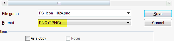
Step 2, the icon: Open the icon.psd and add your logo/art to the file, and turn off the directions layer. (If you need a nice gradient, use the template in Step 3...there are some layers in that file you might like to try out.) Flatten the art (to ensure there is no transparency) and save as a png (use filename: icon.png). We just need the one size, we will generate the rest.
|
|
Step 3, test it in action: Try it out! Download this template from PixelResort: http://appicontemplate.com/ Open the smart layer for the icon and paste in your own, close the psb and see what your icon will look like in action! This template file also has some nice gradients set up as layers, which you may want to use in your icon. |
|
Step 4, the splash: Open the splash.psd from the same zip. The splash template is 2208x2208 with a 1200x1200 square in the center (guides are in the psd template). Fill the background and center your art in the square, we will generate the sizes needed...they will be vertical (iPhone) and horizontal (iPad), so anything outside that square will get cut off. OR, If you would like to create each specific splash screen size separately, we need: these sizes:
|

Need Help?
Contact Rachel at rachel@photofinale.com.