Branding your app.
Pixles, and icons, and splash screens, Oh My! So you've purchased an app, now what? Creating art matching all the requirements can seem intimidating, not to worry -- we've got some tips and tricks to help you through the process.
First, let’s summarize the requirements.
Full app name
This will appear when the app is searched for and in the iTunes store. It should be unique to your business (i.e. your store name) to separate you from others. Many members choose to use the “Foto Source” or “Foto Depot” name, if this is the case - adding your location to the end is a good idea to make your app more searchable, and to avoid customer confusion (Ex: Foto Source – McLean)

Display app name
This will appear on a device’s home screen under your icon. It should be similar to your full app name, however it can’t be longer than 12 characters. Most times the full app name can be shortened using abbreviations: pictures - pics; FotoSource- FS 
TIP: How can you tell if your name is too long? Open safari on your device, click the center menu button, and select add to home screen. Type your display name in the text box given and click add. If the full name shows up you are good to go! If your name appears cut off(see below) you will need to come up with a shorter one.

Icon
Customers will see your icon in the iTunes store, and on their device’s home screen after download. The icon in the app store will show when the app name is searched – this could be on a computer or in the app store on an apple device. Post-download, the icon will show on the user’s home screen of their iPhone/iPad and serves as a gateway to open the application.
![]()
It will always be square, and looks best with no outline - rounded corners are applied once submitted to Apple so any stroke may get cut off.
Sizes needed (in pixels): 1024x1024, 144x144, 114x114, 72x72, 57x57
Splash Screen
These screens appear while an app loads. The size is specific to each device’s full screen size, and will only be visible for a few seconds.

[Sizes needed (in pixels): iPhone-640x960 portrait, iPad 2-1024x768 landscape, iPad-2048x1024 landscape]
Next, let’s talk design.
Whether using an existing logo or creating something completely new, utilize all branding possibilities by following these characteristics: your art should be recognizable based on certain constraints, unique to your business, and representative of app capabilities as well as your current marketing strategy.
Recognizable.
Icons and splash screens should be eye-catching and attractive. Common problems arise in image sizing, resolution, and spacing of elements.
Size: The most common issues arise in image sizing and/or re-sizing, often making art look stretched or blurry. They can be avoided by starting with a correctly sized new canvas, not up-sizing artwork, and keeping proportions. A more in depth overview of sizing is detailed in the how to section below.


Resolution: A resolution (pixles per inch/ppi) too high or too low can also cause image blurriness. An adequate number for these screen images is 72 ppi.
Space: Icons are most commonly viewed on device home screens, these icons are small and can be hard to see. To maximize space, keep your graphic simple and large within constraints. Multiple colors, text, and other effects can cause your icon to look busy and unrecognizable. Keep in mind that the display app name will be shown under the icon, so text is usually not necessary. Splash screens are much larger leaving room for text, graphics, whatever!
Unique.
Maximize branding effectiveness by creating art unique to your business. Use this medium to define or enhance your business’ identity and personality. You can do this by creating art entirely your own, or by using Lucidiom’s generic splash screen available for download here: www.lucidiom.com/share/eqts/pocketpics_splashscreens.zip.
Preview:

Feel free to alter this art in any way to fit into your brand, at minimum a name must be on the screen. Many customers have opted to incorporate a template such as Lucidiom’s or Foto Source’s logo.
Below are two examples from customers who have effectively added their own spin:
Gosselin photo customized the FS icon by altering the red to black. It is simple, yet makes their icon stand out from others using the original FS logo.

Photoworks by Laura altered the generic Pocket Pics splash screen by adding elements apparent on their website.

Representative.
Your art should reflect your current marketing strategy as well as the purpose of the app. By creating a unified message among all interaction nodes, a stronger connection is bound to customers.
Pix[M] has done a nice job of keeping their icon clear, large, and representative of their website through use of their logo. Their splash screens effectively illustrate their app’s purpose in the photo industry.

With design in mind, here is a quick tutorial of the technical side to creating an icon in Photo Shop.
Creating an icon using PS
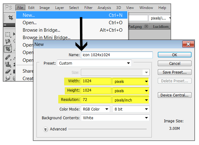
Step 1:
Create a new canvas. (TIP: Starting with the largest icon; 1024x1024, and downsize to save alternative requirements)
Step 2:
Copy and paste any elements (logo/name/etc) on the canvas & move/resize to fit. (TIP: keep proportions during resizing by holding the Shift key while clicking+dragging the element)
Step 3:
Check to ensure there is no transparency. These will be saved as .PNGs (which usually have a transparent background) however, these should be solid all the way through. If they aren’t, the shadows applied by Apple will show through.
![]()
Step 4:
Save as a .png
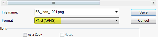
Step 5:
To resize, select image -> image size from the toolbar. Change width and height to the next size down, make sure resolution is still at 72ppi
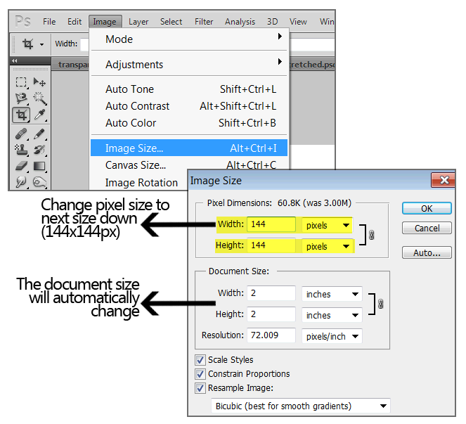
Step 6:
Save again as .PNG and repeat with remaining sizes.